Savvy Synoptic Text Coloring
When doing synoptic studies work, you will inevitably want to display text with coloring (&/or underlining) that presents the data. Some words found only in Matthew, then these words shared between Matthew and Mark, etc. The worst way to proceed is to pick a random color scheme that is easily accessible to you, and then proceed to directly add that text color/highlight color/underline format to selected text as you go. You can quickly find yourself in a place where you are repeating work to change the formatting for another context. Here is an example of the scheme and style sheet I use that represents a savvy scholarly approach that enables your work, illustrating two points:

The two points are:
- Choose a color scheme that has logic to it
- Apply character styles to the text rather than applying direct formatting
1. Since 1995, I have used and advocated for a logical synoptic coloring scheme that uses the primary colors. Given that there are three synoptic gospels, a red text and a blue text and a yellow text can combine to make orange text, green text, purple text, and brown text (or light grey when on a dark background). After extended use, the logic of the color scheme prompts you to see the one, two, or three colors (texts) underlying the coloring information. The colors make for beautiful charts. As in these:
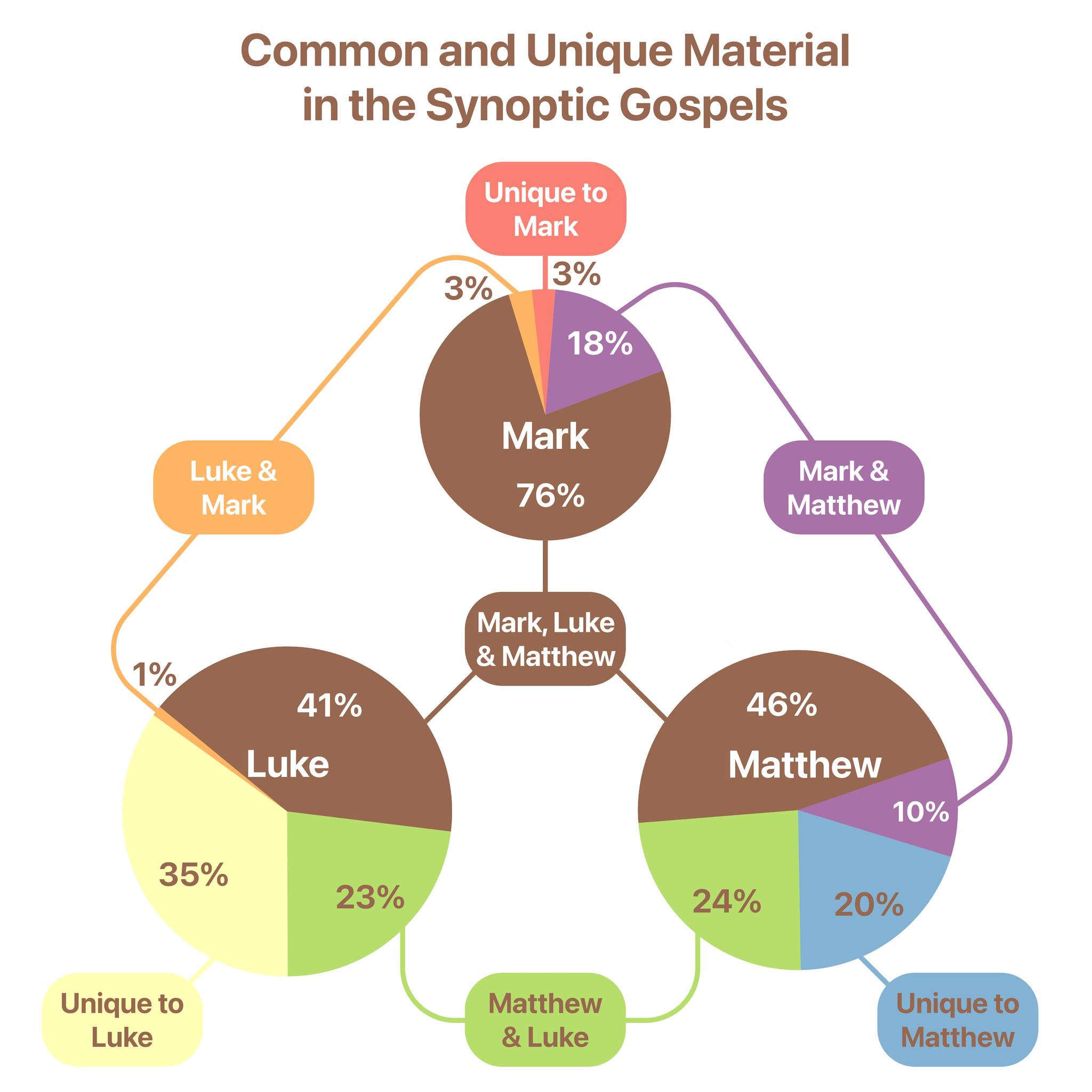

The coloring can be dramatic with shading background coloring, or more subtly as text color. When only using text color on yellow text with a white background, you need to pick a yellow color with a brightness close to 50% (which will look like a very light brown). But bright yellow looks great for text on slides with a dark background . The point is, you can adjust the shade of your colors depending on the context, which leads to the second point.
2. DO👏NOT👏ADD👏FORMATTING👏DIRECTLY👏TO👏YOUR👏TEXT. Use character styles in your word processor. This applies to all writing, really. Your published works will look better and make it through copy-editing better if you use style formatting, rather than direct formatting. If you do not know much about the subject of using styles, find a tutorial learn more. While you can apply a style to a paragraph, something more folks are familiar with (headings, block quotes, etc.), you can also create styles that are character styles, which only add formatting to a selected text. When you apply direct formatting, if you decide to change the shade of a color, you can maybe get by with a savvy change-all but you most likely will be going through and directly applying the color all over again. My suggestion for a style sheet setup is seen in the Word document image above; create a character style for each agreement category (Mark, Matt, Luke, Mark+Matt, Mark+Luke, Matt+Luke, and Mark+Matt+Luke). You can then make each of those styles match your formatting scheme, and then apply those styles to selected text as you go. Upgrade your workflow by adding a custom keyboard shortcut to each of those seven styles.

But here's the beauty and genius of applying styles rather than direct formatting… you can with one step adjust your formatting for Mark+Matthew agreements, and once you make the change in the style, it applies the change EVERYWHERE the style has been applied. Want to adjust the shade of orange everywhere? Boom. Want to add underlining? Boom. Want to change from text coloring to text shading? Boom.
Once you've done the work, you don't have to redo the work. This is so helpful once you've accumulated a long bit of text, possibly across table columns. A side benefit in Word, you can even do things like do a search and restrict that search to a style. Let's say you have a few long pericopes you've applied synoptic character styles to… you can with a search have it highlight everywhere a style is used, or everywhere a particular string occurs but only in one source class.
Being smart about how you set up your work can make the tedious work of doing your formatting go further and serve you across multiple uses.