How Not to do a Bible Widget
Logos Research Systems sent me an email a few weeks ago announcing a Dashboard widget they have released, the Logos Bible Widget. And this appearance confirms my fears about Logos moving into the Mac market--big and slick marketing to accompany a sub-standard product.
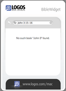
The widget allows you at most to input the reference to a single verse and receive the relevant text from the KJV--and that's it. Put in "John 1:1-2" and it breaks with the message "No such book 'John 3' found." Now, with this limitation of text and range, has this an ounce of utility? The announcement of the widget says:
The main purpose for the widget is to provide Mac users with a speedy alternative to grabbing a Bible off the shelf or going to Bible Gateway to conduct a search there.The limitations of the widget make this statement absurd. Writing a decently robust scripture range parser would only take a couple hours, but it seems the code and hence utility of the widget are an afterthought. And as such, the widget would be a waste of pixel space in one's dashboard--and what a huge waste at that. Click on the image to take a look at the size of this thing:
It shows a complete disregard of Apple's interface standards for widgets. It is the biggest widget I've ever seen, and Apple's standards clearly indicate the minimalist approach for the widget interface. Keep it small, and don't waste space. "Waste space with what?" you may ask. This comes from Apple's Widget UI standards:
A widget is not the place to display aggressive company advertising or branding. Your widget is not merely an entrance to another application, even if that other application performs the processing for the widget’s task. If you take advantage of Dashboard’s prominence to display a banner ad, for example, users will be likely to stop including your widget in the Dashboard display.What makes the Mac experience the Mac experience is that developers give some weight to Apple's UI standards. The folks at Logos who developed this widget were either unaware of these guidelines (implying incompetence as a Mac developer) or ignored them (the symptom of a windoze developer without an appreciation for this aspect of developing on a Mac).
I'm just going to call a duck a duck, here. What I found on my dashboard, was not so much a useful scripture lookup utility as it was a billboard. While the functionality of the widget received little attention, look where it excells--the pretty branding and logos (hmm.... logo... Logos... hmm) The nature of this "aggressive company advertising" includes large branding and a prominent web link, that takes you to their web site's URL "http://www.logos.com/mac/widgetad" that calls it a "widget ad"! Clearly, the widget is "merely an entrance to another application." And what is worse, it is an entrance to another application that doesn't even exist. Well over a year now, Logos announced that they would be finishing a Mac product by the end of 2005, that they were bringing 4,000 titles to the Mac soon. Last year I characterized the premature announcement from Logos as a "me too" announcement in anticipation of Quickverse's proclamation of delivering a Mac product (which they did within a month), and the appearance of this widget simply sustains that line of promotion.
Logos for Mac has clearly plummeted into the abyss of vaporware and if it ever materializes, this widget does not make me optimistic about the result.


7 comments:
Amen! I got the same email. If the purpose was to keep me interested in the supposedly upcoming Logos for Mac software, it totally backfired. I can't think of a worse way to market, than releasing a sucky widget. I hope Logos does a better job on their real software. Even so, I don't think I'll be buying it.
Joe, I got the same email. After installing the widget, I thought (1) Who would use this? and (2) I'm just not sure that Logos "gets" the Mac.
I'm glad you posted this, though; it reminds me that I need to uninstall it.
Yeah, having just downloaded it, it is a total waste of space. No other versions, single verses and HUGE waste of space. Goodbye widget...
If you think the widget took up too much screen space, try out the version I modified, which is 25% smaller, roughly twice the height of Apple's Calendar widget. No warranties or anything implied or stated; I just got tired of it taking up too much space on my itty bitty screen and thought you might like the modified version, too.
http://www.desisoftsystems.com/user/biblewidget/BibleWidgetSmall.zip
Wow. According to this, the book of Corinthians doesn't exist. Funny, I'm sure it's in my bible...
Hey, so when is all said and done, where do I get a bible widget that I can use safely and effectively?
Hi, Anthony.
Accordance Bible software has a widget that integrates amazingly with their software, allowing you to look up any text module you have and even in one key, paste it into your current place in another app.
If you're looking for a free, decent widget, I think someone still maintains a Bible Widget for Gateway website. You can Google for it.
Post a Comment